


Script Embroidery Fonts: How to Choose the Right Style

How do you choose Script Embroidery Fonts that look beautiful and remain clear after stitching? A font may appear elegant on screen but lose fine details, readability, or smooth connections on fabric. This guide shows you how to match script styles to your project, choose the right size and prioritize stitchability for polished, professional embroidery results.
1. What makes a good script embroidery font?
Script embroidery fonts are lettering designs with flowing strokes, curved letterforms, and connected or handwritten-style characters. They are often used when you want embroidery to look elegant, personal, or decorative.
Common script styles include:
- Classic Script: graceful and traditional, with balanced curves and formal letterforms.
- Handwritten Script: natural and relaxed, similar to everyday handwriting.
- Calligraphy Script: refined and decorative, often with contrasting strokes and elegant flourishes.
- Bold Script: heavier strokes and stronger shapes for better visibility.
- Decorative or Swash Script: extended strokes and ornamental details for a more expressive look.
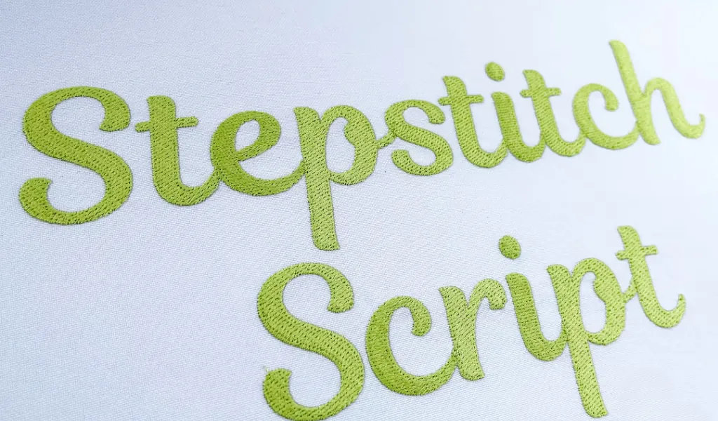
A good script embroidery font should combine attractive letterforms with embroidery-friendly construction. Clear connections, balanced spacing, suitable stroke thickness, and appropriate detail help the lettering remain recognizable after stitching.
2. Why are script fonts trickier to embroider?
Script fonts are harder to embroider well because thread has real physical thickness, and it can't reproduce the same fine, tapering strokes a pen can draw on paper.
The more intricate the style, the more carefully you need to consider:
- Fine strokes can disappear: Thin lines and small flourishes may lose definition or become difficult to read, especially at smaller sizes.
- Connected letters need precision: Flowing letter connections can become crowded or overlap if the design isn’t properly digitized.
- Fabric affects clarity: Textured, stretchy, or unstable fabrics can make delicate strokes look uneven or less defined.
- Size matters: A script font that works beautifully at one size may lose detail or readability when scaled too small. Embroidery fonts should generally be used within their recommended size range.
- Style makes a difference: Simpler scripts with slightly stronger strokes tend to embroider more consistently than highly decorative styles.
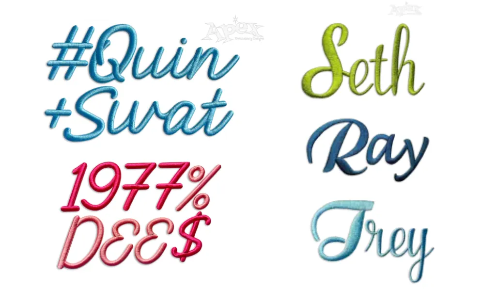
Ultimately, choosing the right font style and size is key. A script font should be able to maintain that elegance once translated into stitches.
3. How to choose the right style for your project?
The right script embroidery style depends on where the lettering will go, how large it needs to be, and how much detail the design area can handle. Start with practical requirements, then choose the visual style that best matches your project.
3.1 Start with where the lettering will go
The placement and purpose of the embroidery should guide your font choice:
3. How to choose the right style for your project?
The right script embroidery style depends on where the lettering will go, how large it needs to be, and how much detail the design area can handle. Start with practical requirements, then choose the visual style that best matches your project.
3.1 Start with where the lettering will go
The placement and purpose of the embroidery should guide your font choice:
| Project | Recommended Script Style | Why |
| Towels & totes | Decorative/Swash Script or Calligraphy Script | Larger embroidery areas allow curves, flourishes and finer details to remain visible. |
| Shirts | Handwritten Script or Classic Script | Medium-size lettering provides a good balance between elegance and readability. |
| Hats | Bold Script or Open Handwritten Script | Limited space and the curved surface make delicate lettering harder to reproduce clearly. |
| Small patches or tags | Bold Script or Simple Handwritten Script | Fewer fine details help maintain letter definition at smaller sizes. |
| Monograms | Classic Script or Calligraphy Script | These styles add a distinctive, personalized look when enough space is available. |
| Wedding projects | Calligraphy Script or Decorative / Swash Script | Decorative details can enhance the formal aesthetic without overwhelming the design. |
| Baby items | Handwritten Script | Open, uncomplicated letterforms remain friendly and readable in embroidery. |
| Branding | Classic Script, Handwritten Script, or Bold Script | A clean structure improves consistency, recognition, and production reliability. |
The goal is not simply to choose the most attractive font. Choose a script style that suits the project’s purpose and has enough space to maintain its essential shapes, spacing, and details after digitizing and stitching.
3.2 Consider the size
Font size directly affects stitch quality. A delicate script may look excellent at 3 inches but lose important details when reduced to ½ inch.
As a practical guideline:
- Under 1 inch: Bold, open lettering with minimal detail
- 1 - 2 inches: Clean handwritten or moderately detailed scripts
- 2 4 inches: Calligraphic and decorative styles become more practical
- Over 4 inches: More elaborate scripts and flourishes can be reproduced with greater definition
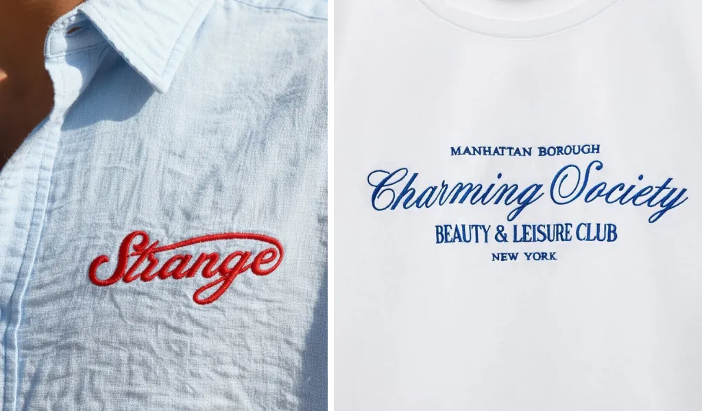
These ranges are guidelines, not fixed rules. The actual result depends on the font construction, digitizing, stitch type, fabric, and production method. Always follow the font’s recommended size range whenever one is provided.
3.3 Prioritize stitchability in small areas
When embroidery space is limited, clarity should come before decoration. A script with extremely thin strokes may require too few stitches to maintain its shape. Closely connected letters can also create excessive stitch density, while small flourishes may become lost in the surrounding stitches.
If the lettering looks crowded, consider a more open font. If thin strokes lack definition, move to a heavier style or increase the size rather than forcing the original font smaller.
If your project genuinely needs small lettering, switching from a thin, elegant script to a bolder, more open one will almost always give a cleaner result than forcing a delicate font down to a size it wasn't built for.
4. Where is the download script embroidery font?
You can find free and premium script embroidery fonts on specialized embroidery websites. For professionally digitized designs, Apex Embroidery Designs offers more than 150 script embroidery fonts backed by over 25 years of industry experience.
Its collection spans Classic, Handwritten, Decorative, Chain Stitch, Running Stitch, Appliqué, and 3D styles, suitable for names, monograms, apparel, hats, and personalized projects.
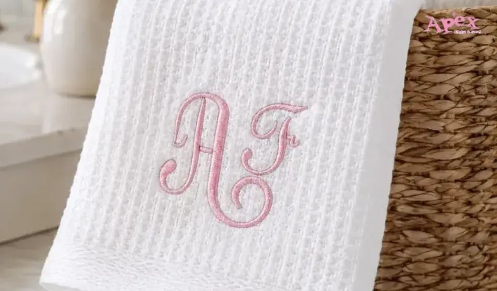
Most fonts are available as instant digital downloads in popular machine formats, including PES, DST, ART, EXP, JEF, HUS, SEW, VIP, VP3 and XXX, with BX files available for Embrilliance on many designs.
Before downloading, check the style, size range, stitch type, and file format to ensure the font matches your project and embroidery machine. For further assistance, visit our Contact Us page.
5. Script Embroidery Fonts FAQs
5.1 What size is best for script embroidery?
There is no single ideal size for every script font, but 10 - 12 mm (0.4 -0.5 in) is a practical minimum range for many embroidered scripts. Below this size, thin strokes, connected letters, and small flourishes are more likely to lose definition.
The ideal size also depends on font weight, stitch density, fabric type, and viewing distance. A bold, open script can work at a smaller size, while delicate calligraphy usually needs more room to preserve its character.
When in doubt, size up rather than down. Slightly larger lettering generally gives the stitches more room to maintain clean shapes, readable connections, and consistent definition.
5.2 Is script or block embroidery font better for items?
Selecting the right embroidery font depends on the intended use, placement and legibility requirements.
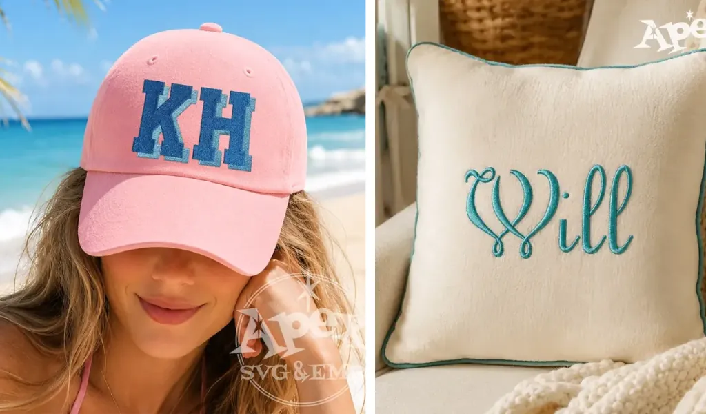
- Choose block fonts when readability is the priority. Their strong, consistent strokes make them ideal for uniforms, teamwear, workwear, caps, small logos, and lettering that needs to remain clear from a distance. They also tend to perform more reliably on textured or stretchy fabrics.
- Choose script fonts when style and personality matter more. Their flowing letterforms work especially well for monograms, personalized gifts, wedding items, boutique apparel, and decorative branding. However, they usually require more space and careful digitizing to preserve fine strokes and connected letters.
If you are still undecided, consider the viewing distance and the actual embroidery area before making your choice.
6. Conclusion
Choosing the right script embroidery fonts means balancing style, size, stitchability, and compatibility. Elegant lettering only works when its details remain clear after stitching. Choose simpler, bolder scripts for small areas and more decorative styles when space allows. Always check the font’s recommended size, stitch quality, and machine format before downloading. By considering these factors together, you can select a script font that not only looks beautiful on screen but also produces clean, readable, and professional embroidery in the finished project.